The Identity Problem
Most brands look and feel the same. Browse any industry and you'll find a sea of similar color palettes, interchangeable messaging, and identical photography styles. This sameness is the result of fear—fear of standing out, fear of alienating potential customers, fear of being different.
But blending in is the most dangerous thing a brand can do.

Why Distinctiveness Matters
When your brand looks like everyone else's, you're competing on features and price alone. That's a race to the bottom that few win. Distinctive brands create emotional connections that transcend rational comparison shopping.
Consider the brands you're loyal to. Chances are, they don't just sell products you like—they represent something you believe in or an identity you want to project. That's the power of brand distinctiveness.
Our Identity Development Process
Step 1: Community Immersion
Before we design anything, we spend time understanding the community we're serving. We're not just looking at demographics—we're studying:
- The language and vocabulary the community uses
- The visual aesthetics they're drawn to
- The values they hold dear
- What they're rebelling against
- Who they admire and why
This cultural research shapes every decision that follows.
Step 2: Finding the Edge
Every community has edges—the characteristics that define who's in and who's out. Strong brands lean into these edges rather than softening them.
We ask: What would make this community say "finally, something for us" while making others shrug? That polarization is actually a strength. A brand that excites some people and doesn't resonate with others is more powerful than one that generates mild interest from everyone.
Step 3: Voice Development
Brand voice is how your brand speaks. It's the personality that comes through in every piece of copy, every customer interaction, every social media post.
We develop voice by defining:
- Tone: Formal or casual? Serious or playful?
- Vocabulary: What words does this brand use and avoid?
- Perspective: What does this brand believe? What does it stand for?
- Rhythm: Short, punchy sentences or flowing prose?
The voice should feel natural to the community while being distinct enough to be recognizable.
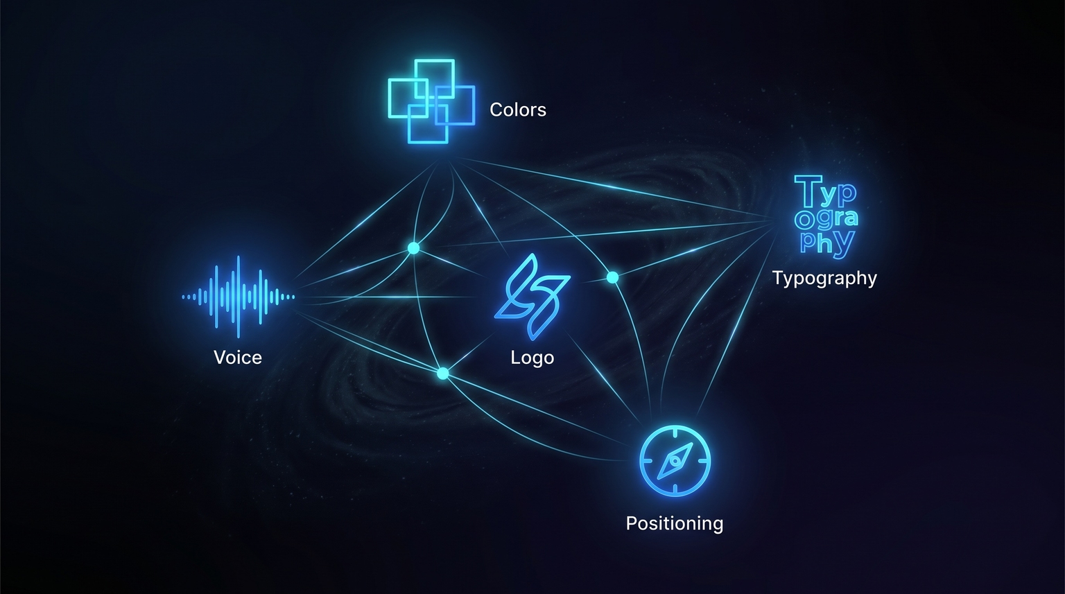
Step 4: Visual Identity
Visual identity is where most people start. We intentionally leave it for later because the strategic work above should inform every visual decision.
Our visual development covers:
- Color palette: Colors carry meaning and emotion. We choose colors that align with the brand's personality and stand out in the competitive landscape.
- Typography: Fonts communicate personality before anyone reads a word. We select type that feels right for the community.
- Imagery style: The approach to photography, illustration, or graphics that feels authentic to the brand.
- Design principles: The rules that govern how visual elements combine.
Step 5: Application
A brand identity only matters when it's consistently applied. We create comprehensive systems that ensure consistency across:
- Digital products and interfaces
- Marketing materials
- Social media presence
- Customer communications
- Physical touchpoints
Principles We Follow
Be Authentic, Not Aspirational
The best brand identities reflect genuine truths about the community, not aspirational visions of who they might become. Authenticity resonates; aspiration feels hollow.
Embrace Constraints
We don't try to be everything. Constraints—in color palette, in tone, in messaging—create coherence. They make the brand feel considered and intentional.
Design for Recognition
The goal is for someone to see a piece of content and immediately know it's from your brand, even without a logo. This requires consistent application of distinctive elements.
Evolve Thoughtfully
Brands aren't static, but changes should be evolutionary, not revolutionary. Each evolution should feel like a natural progression, not a jarring shift.

The Result
When done well, a distinctive brand identity creates instant recognition and emotional connection. Community members feel like the brand was made for them because, in a real sense, it was.
This isn't about surface-level design—it's about building brands that genuinely represent and serve specific communities. That's the work that matters.